
The {coolorrr} Package for Custom R Palettes
One of the things I love about teaching an introductory course on data
visualization in R is the limitless opportunity for developing tools
that ease students into otherwise highly technical concepts. On this
front, I recently introduced my students to custom color palettes in
{ggplot2}. As I was brainstorming how best to do so, I quickly
realized that I would need to do some hand-holding.
{ggplot2} provides some excellent choices for customizing color
palettes, and many packages have been developed to support even greater
flexibility in palette customization. But when I considered alternative
ways to teach my students, I kept wishing that existing options were
more streamlined. Why do there have to be different functions for
different aesthetic mappings and for qualitative, sequential, and
diverging palettes?
I quickly realized that it would be really easy for my students to get lost in the details, which was a problem. Not only did I worry about unintentionally discouraging them, all I really wanted to do was let students focus their energy on the creative process of identifying their favorite palettes.
So, I quickly cobbled together some helper
functions
that I had students call with the source() command. I wrote these
functions with the open source and easy to use
Coolors website in mind. My students’ workflow
would be simple: copy urls for Coolors palettes they developed and use a
function that sets those palettes globally in their R session. Then, use
a single function using the + function() syntax of {ggplot2} that,
given just a few extra commands, would automatically pick the correct
function “under the hood” to implement a certain palette.
This ended up being a pretty successful approach. Students were able to quickly select and implement palettes in class, and, aside from a few bugs I soon realized I’d need to fix, the palette helper functions worked seamlessly in class.
It wasn’t long after I introduced these helpers that I realized it might
be worthwhile to just write an R package. And, so I did. Inspired by the
site I was using to let students select palettes, I named the package
{coolorrr}, and it’s
available to install from GitHub by writing:
# install.packages("devtools")
devtools::install_github("milesdwilliams15/coolorrr")
Setting Palettes Globally
While the code has been modified and improved since I first introduced it to my students, the overall workflow the package supports is the same.
- Set palettes globally;
- Apply palettes to a
ggplotobject.
Pretty simple stuff.
The first step is done using the set_palette() function. It can be
used as-is without supplying any commands (be warned, you’ll be
subjected to my bad taste in colors!):
library(coolorrr)
set_palette()
Once you’ve run this function, you’ll notice that you now have four new
objects in your global environment: qual, dive, sequ, dual.
Observe:
qual
## [1] "#265a73" "#e8c547" "#b0bbbf" "#a85751" "#331832"
dive
## [1] "#265a73" "#eff1f3" "#df2935"
sequ
## [1] "#eff1f3" "#265a73"
dual
## [1] "#faa916" "#265a73"
The first is an object containing the hexidecimal codes for a 5 color qualitative palette (more colors could be used if needed). The second is an object containing the same for a diverging palette with a minimum, middle, and maximum color specified. The third is an object containing the same for a sequential palette with the minimum and maximum color specified. The last is a special qualitative palette for when you only have two categories.
Mercifully, you aren’t limited to the default selections. You can update any of these four palettes in one of two ways.
First, you can go to coolors.co and either use
the palette generator or any one of the pre-selected trending palettes
by copying the url for the specific palette and copying it as a
character string in set_palette(). For example, say I picked this 10
color (fall themed!) qualitative palette:
https://coolors.co/palette/fabb7d-fb8333-605f64-c0321a-9b6a6c-b78d87-af8066-3f4a5d-999380-8c2c1a.
To use it, I would write:
# coolor url
qual_url <- "https://coolors.co/palette/fabb7d-fb8333-605f64-c0321a-9b6a6c-b78d87-af8066-3f4a5d-999380-8c2c1a"

# set with custom qualitative palette
set_palette(
  qualitative = qual_url
)
The qual object in the global environment now is:
qual
##  [1] "#fabb7d" "#fb8333" "#605f64" "#c0321a" "#9b6a6c" "#b78d87" "#af8066"
##  [8] "#3f4a5d" "#999380" "#8c2c1a"
Of course, you aren’t limited to colors that you can find and palettes you can build at coolors.co. You can use all the standard R colors, too.
Say we wanted a purple based sequential palette. We would write:
set_palette(
  sequential = c("white", "purple"),
  from_coolors = FALSE
)
sequ # this updates the sequ object
## [1] "white" "purple"
By selecting FALSE for from_coolors, the function knows that the
palette is not coming from coolors.co. This stops it from doing a bunch
of stuff under the hood to extract the hexidecimal color codes from the
palette relevant Coolors url. If you don’t set this command to FALSE,
you run the risk of getting values that R doesn’t understand. Check it
out.
set_palette(
  sequential = c("white", "purple")
)
sequ
## [1] "#white" "#purple"
The function still runs, but now its doing a bunch of stuff,
erroneously, to the vector of colors we’ve tried to use for the
sequential palette. The result is that instead of a vector with the
values “white” and “purple” we have a vector with the values “#white”
and “#purple” which will create an error if we try to update a
sequential palette for ggplot.
Now, I know what you’re thinking. What if you want to set one palette
with colors in R and another with a palette you found or made at
coolors.co? You can do that by simultaneously setting
from_coolors = FALSE and applying a function called coolors() to the
coolors.co url:
# the new color palettes
qual_url <- "https://coolors.co/palette/fabb7d-fb8333-605f64-c0321a-9b6a6c-b78d87-af8066-3f4a5d-999380-8c2c1a"
sequ_vec <- c("white", "purple")

# setting simultaneously
set_palette(
  qualitative = coolors(qual_url),
  sequential = sequ_vec,
  from_coolors = FALSE
)
qual; sequ # check
##  [1] "#fabb7d" "#fb8333" "#605f64" "#c0321a" "#9b6a6c" "#b78d87" "#af8066"
##  [8] "#3f4a5d" "#999380" "#8c2c1a"

## [1] "white"  "purple"
The coolors() function is a helper that converts a coolors.co url to a
vector of hexidecimal color codes:
coolors(qual_url)
##  [1] "#fabb7d" "#fb8333" "#605f64" "#c0321a" "#9b6a6c" "#b78d87" "#af8066"
##  [8] "#3f4a5d" "#999380" "#8c2c1a"
Using your palettes
After you’ve set your palettes, all that remains is to apply them to
your ggplots. This is done with the ggpal() function.
This function has three default options, but it can also pass other
generic commands to various {ggplot2} functions under the hood.
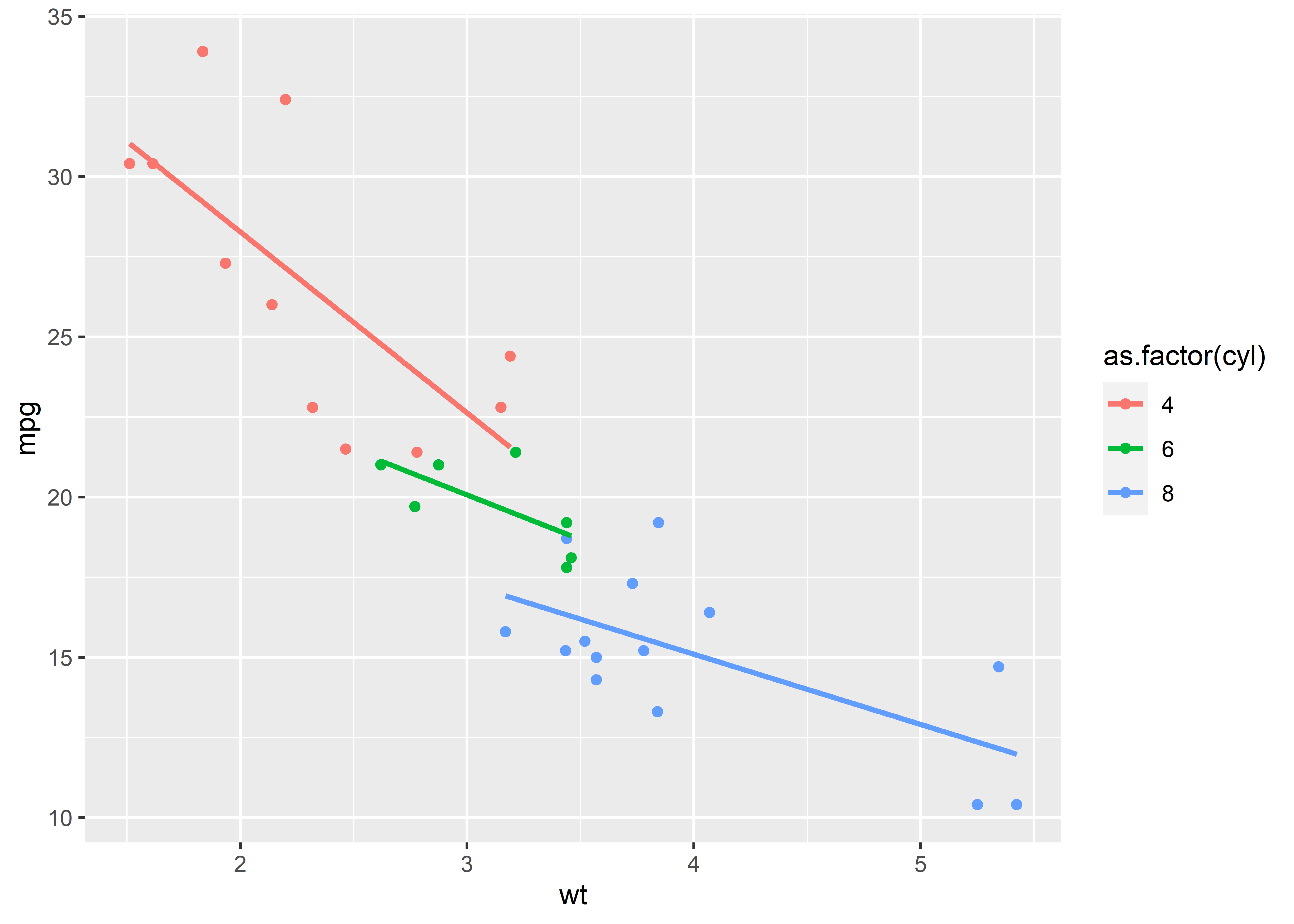
Here’s a basic example using mtcars. The below script makes a scatter
plot with linear regression lines that shows the miles per gallon by
weight of various cars. The color aesthetic is used to map point and
regression line colors to the number of cylinders per car. To start, the
output just uses ggplot’s default color palette.
library(ggplot2)

# use mtcars data
p <- ggplot(mtcars) +
  aes(x = wt,
      y = mpg,
      color = as.factor(cyl)) +
  geom_point() +
  geom_smooth(method = "lm",
              se = FALSE)
p # print
To use our own palette with {coolorrr}, after we’ve opened the package
with a call to library(), we just use set_palette() to set our
custom palettes globally, and then we call them as needed using
ggpal(). The below script sets the palette using defaults and then
applies the qualitative palette for the colors aesthetic.
set_palette() # using defaults
p + ggpal()
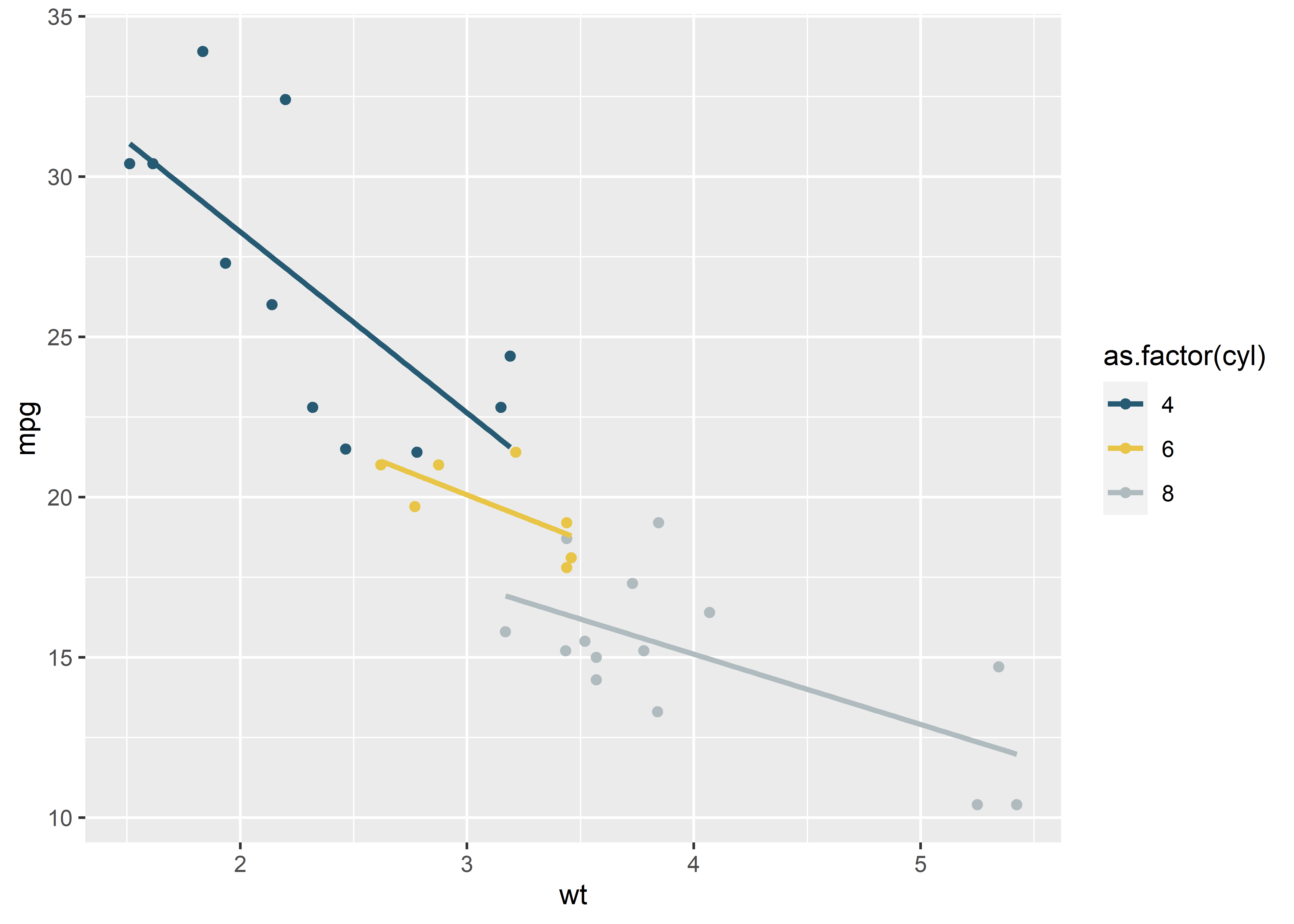
By default, ggpal() is set to
ggpal(type = "qualitative", aes = "color", midpoint = 0). Other
options for type include "diverging", "sequential", and "binary".
The aes command can be either "color" or "fill". The midpoint option
can be any real valued number (this indicates what midpoint should be
used if a diverging palette is called).
If we don’t update our type and aes options appropriately, ggpal()
will fail to update the palette. For example, here’s the same example as
above, but aes has been mistakenly set to “fill”. Note that the output
has not been updated.
p + ggpal(type = "qualitative", aes = "fill")

Here’s an example where using the fill aesthetic would be the appropriate choice. To mix things up, let’s use that fall-based theme I lifted from coolors.co for the qualitative palette. The below figure shows average miles per gallon by the number of cylinders. It then uses colors to distinguish cars by the number of carburetors.
qual_url <- "https://coolors.co/palette/fabb7d-fb8333-605f64-c0321a-9b6a6c-b78d87-af8066-3f4a5d-999380-8c2c1a"
set_palette(
  qualitative = qual_url
)
p <- ggplot(mtcars) +
  aes(x = as.factor(cyl),
      y = mpg,
      fill = as.factor(carb)) +
  geom_col(position = "dodge") +
  ggpal(aes = "fill")
p

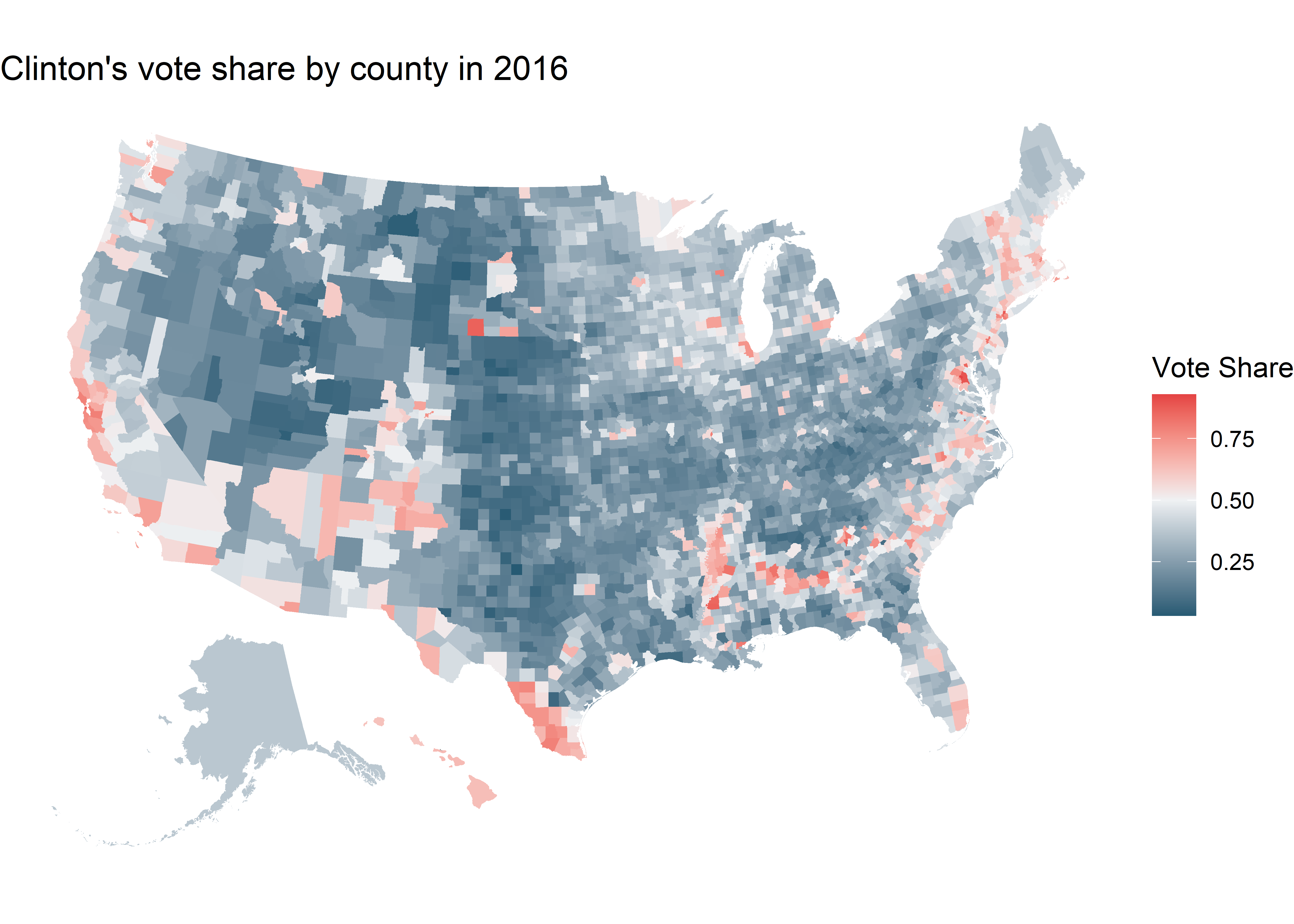
Usage for sequential and diverging palettes is similar. Below is an example of an application of a sequential palette. The code below produces a map of the US showing Hillary Clinton’s vote shares in the 2016 US presidential election at the county level. The sequential palette is used to indicate said vote shares.
# get county level data and merge
library(socviz)
library(dplyr)
county_full <- left_join(x = county_map,
                         y = county_data,
                         by = "id")

# plot a map of the US showing Clinton's 2016 vote shares
p <- ggplot(county_full) +
  aes(x = long,
      y = lat,
      group = group,
      fill = per_dem_2016) +
  geom_polygon(size = 0.05) +
  theme_void() +
  coord_equal() +
  ggpal(type = "sequential", aes = "fill") +
  labs(title = "Clinton's vote share by county in 2016",
       fill = "Vote Share")
p

A diverging palette could also be applied to this data. The below script creates an identical figure to that produced above except that now the diverging palette is called with its midpoint set to 0.5.
p <- ggplot(county_full) +
  aes(x = long,
      y = lat,
      group = group,
      fill = per_dem_2016) +
  geom_polygon(size = 0.05) +
  theme_void() +
  coord_equal() +
  ggpal(type = "diverging", aes = "fill", midpoint = 0.5) +
  labs(title = "Clinton's vote share by county in 2016",
       fill = "Vote Share")
p
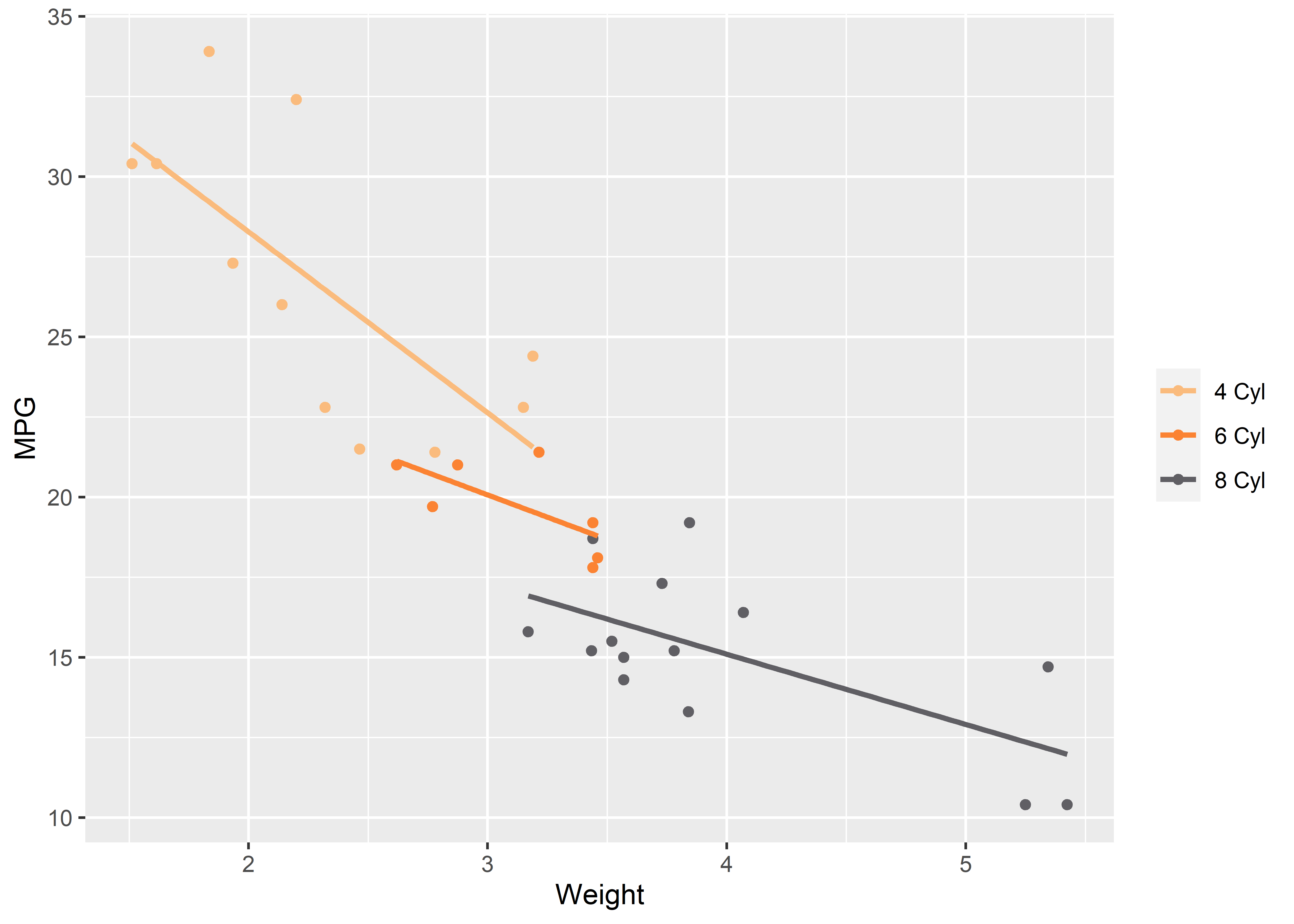
A final note about ggpal() is that it will also pass any number of
other commands to the functions it applies under the hood. For example,
when a qualitative palette is used ggpal() passes information to one
of the scale_*_manual() functions. This function allows for adding
custom color or fill labels. So does ggpal() by extension.
p <- ggplot(mtcars) +
  aes(x = wt,
      y = mpg,
      color = as.factor(cyl)) +
  geom_point() +
  geom_smooth(method = "lm",
              se = FALSE) +
  ggpal(labels = c("4 Cyl", "6 Cyl", "8 Cyl")) +
  labs(x = "Weight",
       y = "MPG",
       color = NULL)
p
Conclusion
{coolorrr} is not the
only R package for incorporating custom palettes with ggplot, but it has
some tools that are useful for me. I hope the same is true for others.