
Regression Discontinuity: Local Regression vs. Randomization?
Which regression discontinuity approach is better: local linear regression or local randomization?
I generally prefer the former over the latter. Why? Because even though local randomization lets you analyze the data in a way that approximates a randomized controlled trial, it comes with a couple of assumptions that only hold up under select conditions.
Chief among these assumptions is that treatment assignment is as good as random within a bandwidth around the threshold defining treatment assignment in the running variable (e.g., continuity at the threshold and no sorting). The second assumption is that the outcome variable is orthogonal to the running variable that determines treatment assignment within this bandwidth.
The first assumption is technically relevant for the classical local regression approach as well. If there were factors that led individuals in a study to sort on one or the other side of the threshold of the running variable, this would raise questions about the validity of local regression results, too. So, regardless of the approach, noise should be the primary reason why some observations fall just above or below the discontinuity.
The second assumption is a strong one and can be problematic. Also, it isn’t necessary with local regression. While local randomization just assumes away any correlation between the running variable and the outcome within the defined bandwidth, local regression explicitly adjusts for this correlation to the extent that it exists in the data. So why bother with local randomization?
One advantage of local randomization is interpretability. In the most extreme case, the estimand is just the simple difference in means between treated and untreated units within a defined bandwidth. Conversely, in the case of local regression the estimate is local to the exact point of the discontinuity in the running variable. In some cases, this may reflect an interpolation between treated and untreated units where no observations actually exist.
Another advantage is a slight improvement to statistical power. Estimating the treatment effect at the precise point of the discontinuity can be subject to extra noise. If orthogonality holds, local regression (all else equal) gives you larger standard errors.
Even so, in this post I run a simulation that shows why I tend to prefer the local regression approach (interpolation and loss of statistical power aside). First, it provides an unbiased estimate of the LATE whether or not the outcome is orthogonal to the running variable. That means there’s one less assumption I need to deal with in my analysis, and as a general rule I like to make as few assumptions as possible. Second, despite a modest decline in precision, its standard errors still provide appropriate coverage.
Let’s get to the simulation.
The setup
Here are the packages I’m using in this session:
library(tidyverse)
library(seerrr)
library(estimatr)
library(geomtextpath)
library(ggridges)
library(coolorrr)
set_theme()
set_palette()
I’ll use the simulate function from the {seerrr} package to get the
simulation started. I’ll do 200 draws of 500 observations from a
data-generating process defined such that:
- There is a running variable, “X”, from 1 to 20 that follows a uniform distribution.
- The threshold in X defining treatment assignment is at X > 10.
- There are three versions of the outcome variable “Y”. One where it is orthogonal to X, another where it is positively correlated with X, and a third where it is positively correlated with X and there is a positive slope change in the relationship between X and Y under treatment as well.
- Across outcomes, the true local treatment effect at the discontinuity is 0.5.
Here’s the code. The draws from the d.g.p. are saved as a list object named “dt_sims”.
# simulate from a d.g.p. 200 times
simulate(
  # the sample size
  N = 500,
  # the running variable
  X = sample(1:20, N, T),
  # the treatment
  tr = ifelse(X > 10, 1, 0),
  # noise
  U = rnorm(N),
  # outcome that is orthogonal to running variable
  Y1 = 0.5 * tr + U,
  # outcome that is correlated with running variable
  Y2 = 0.5 * tr + X + U,
  # outcome is correlated with running variable + interaction
  Y3 = 0.5 * tr + X + 0.1 * (X - 10) * tr + U
) -> dt_sims
Just to check that the simulation worked as planned, I’ll check one of the 200 datasets drawn from the d.g.p. The below figure uses a jitter plot to show how the running variable X relates to treatment assignment. It should be the case that tr = 1 for all X > 10 and 0 otherwise. This is indeed the case.
ggplot(dt_sims[[1]]) +
  aes(x = X, y = tr) +
  geom_jitter(height = 0.01) +
  labs(
    x = "Running variable (X)",
    y = "Treatment status",
    title = "Treatment assignment and the running variable"
  )

I can also inspect one of the datasets to see how the running variable relates to the outcome. The below figure shows a scatter plot with linear regression lines plotted for each of the versions of the outcome. Color is used to distinguish which is which. Again, we can see that the d.g.p. worked as planned. Importantly, we can see a slight bump or discontinuity in the outcomes at the threshold defining treatment assignment. That’s our treatment effect! It’s small, but it’s there.
dt_sims[[1]] |>
  select(Y1:Y3, X) |>
  pivot_longer(
    -X
  ) |>
  ggplot() +
  aes(x = X, y = value,
      color = name) +
  geom_point(
    alpha = 0.5
  ) +
  geom_smooth(
    formula = y ~ x * I(x > 10),
    method = "lm",
    se = F
  ) +
  labs(
    x = "Running variable (X)",
    y = "The outcome",
    title = "Treatment assignment and the outcome",
    color = "Outcome"
  ) +
  ggpal() +
  geom_textvline(
    xintercept = 10,
    label = "Treatment",
    hjust = 1,
    linetype = 2
  )

The Naive Approach
We can take a few different approaches to estimating the treatment effect. The naive approach is to just do a simple linear model, regressing the outcome on the treatment indicator. The below code does this for each of the versions of the outcome across the 200 draws from the d.g.p. The output is saved as a dataframe called “reg_out”. I’ve printed the first five rows, so you can see what it looks like.
list(
  Y1 ~ tr,
  Y2 ~ tr,
  Y3 ~ tr
) |>
  map_dfr(
    ~ estimate(
      data = dt_sims,
      .x,
      vars = "tr",
      se_type = "stata"
    )
  ) -> reg_out
reg_out[1:5, ] # here's the output
##   term  estimate  std.error statistic      p.value  conf.low conf.high  df
## 1   tr 0.5008222 0.09107611  5.498942 6.115163e-08 0.3218814 0.6797630 498
## 2   tr 0.7777249 0.09167635  8.483376 2.512168e-16 0.5976048 0.9578450 498
## 3   tr 0.6454257 0.09341677  6.909099 1.496412e-11 0.4618862 0.8289653 498
## 4   tr 0.4162632 0.08902078  4.676023 3.771939e-06 0.2413606 0.5911658 498
## 5   tr 0.6043693 0.08957654  6.746959 4.204590e-11 0.4283747 0.7803638 498
##   outcome sim
## 1      Y1   1
## 2      Y1   2
## 3      Y1   3
## 4      Y1   4
## 5      Y1   5
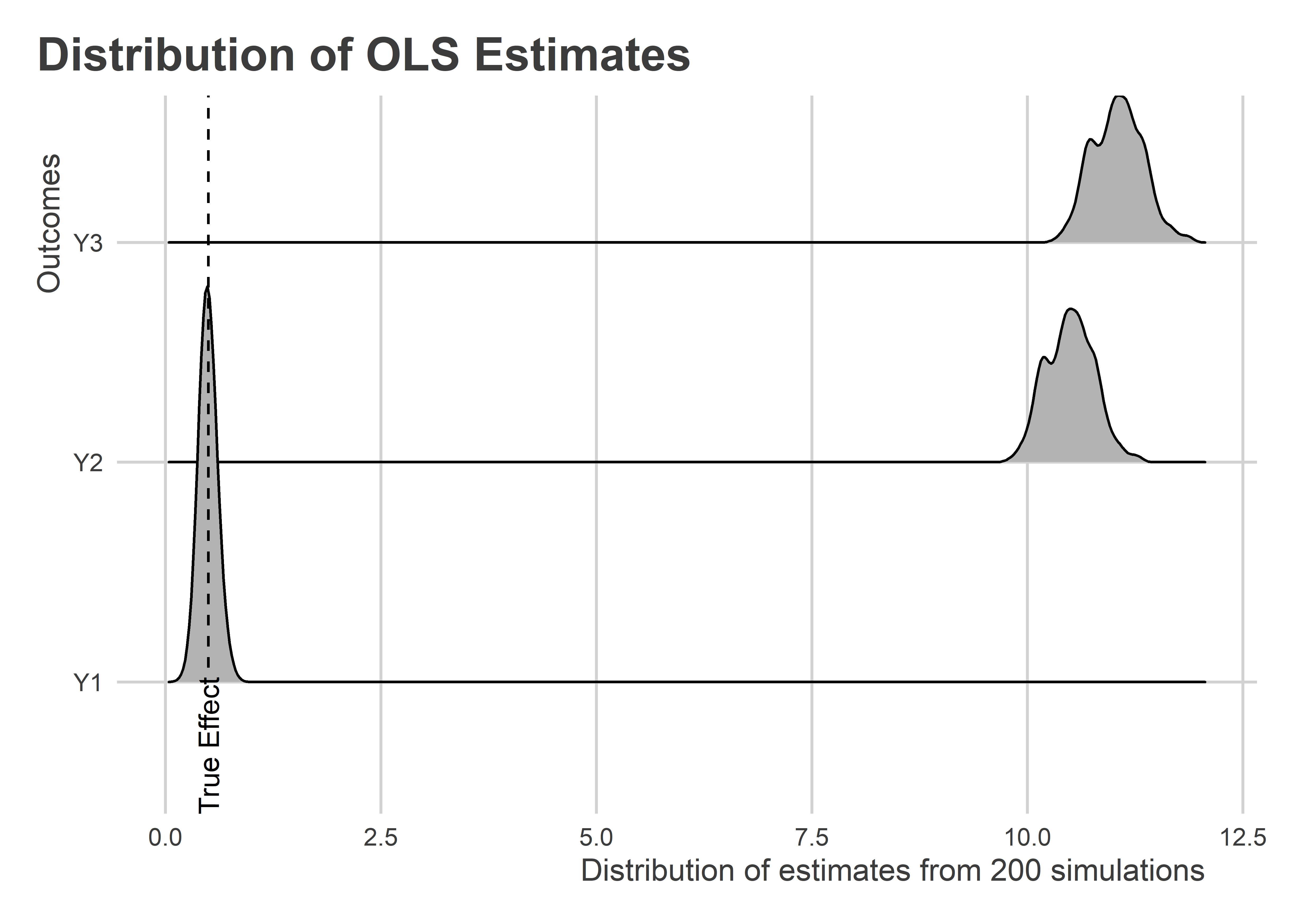
We now have estimates for the treatment effect for each of the outcomes and for each of the alternative data samples. The below figure summarizes the distribution of these estimates using a ridge plot. As we would expect, only when Y is orthogonal to X does this naive research design provide us with an unbiased estimate of the treatment effect. In the cases where X and Y are positively correlated, this approach yields estimates that are several times larger than the true effect size.
ggplot(reg_out) +
  aes(
    x = estimate,
    y = outcome
  ) +
  geom_density_ridges() +
  geom_textvline(
    xintercept = 0.5,
    label = "True Effect",
    linetype = 2,
    hjust = 0
  ) +
  labs(
    x = "Distribution of estimates from 200 simulations",
    y = "Outcomes",
    title = "Distribution of OLS Estimates"
  )
Going Local
The idea with the local randomization approach is that if we narrow the bandwidth around the threshold in the running variable, we can recover an unbiased estimate of the treatment effect. But, remember, it needs to be the case that (1) treatment assignment is as-if-random in this bandwidth and (2) Y is orthogonal to X in this bandwidth. The first is true, but the second is only true for Y1.
The smallest bandwidth we might try is +/- 1. This is also a range in which it a local regression would be impossible since treatment assignment would be singular to the running variable (this is a result of the discrete nature of X). The below code implements this approach by limiting the data to only observations +/- 1 of the threshold at X > 10 (i.e., only cases where X is 10 or 11).
dt_sims |>
  map(
    ~ .x |>
      filter(between(X, 10, 11))
  ) -> bw_dt_sims
list(
  Y1 ~ tr,
  Y2 ~ tr,
  Y3 ~ tr
) |>
  map_dfr(
    ~ estimate(
      data = bw_dt_sims,
      .x,
      vars = "tr",
      se_type = "stata"
    )
  ) -> reg_out_2
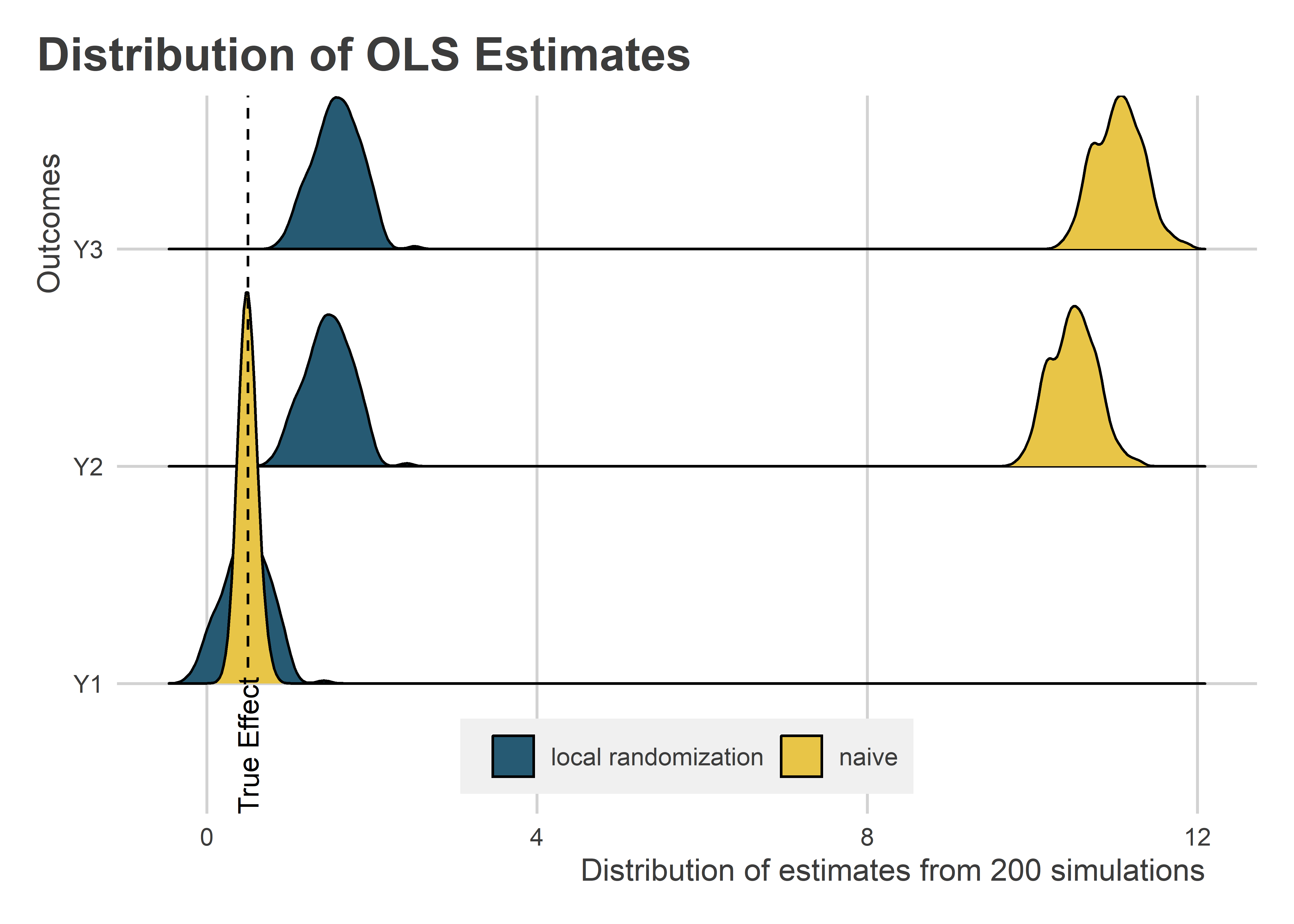
Let’s look at the results and compare with those obtained using the naive approach from earlier. The below figure uses a ridge plot show the distribution of estimates for each of the outcomes, and now for the local randomization plus simple regression designs. Clearly, this approach improves on the naive regression when Y is correlated with X. There still is an upward bias, but it’s orders of magnitude smaller.
bind_rows(
  reg_out |> mutate(sample = "naive"),
  reg_out_2 |> mutate(sample = "local randomization")
) |>
  ggplot() +
  aes(
    x = estimate,
    y = outcome,
    fill = sample
  ) +
  geom_density_ridges() +
  geom_textvline(
    xintercept = 0.5,
    label = "True Effect",
    linetype = 2,
    hjust = 0
  ) +
  labs(
    x = "Distribution of estimates from 200 simulations",
    y = "Outcomes",
    title = "Distribution of OLS Estimates",
    fill = NULL
  ) +
  ggpal(aes = "fill") +
  theme(
    legend.position = c(0.5, 0.08)
  )
Can we do any better with local regression? To estimate the local regression, we need to specify a model that includes both the treatment indicator, the running variable, and their interaction. The below code does this. Importantly, the running variable is centered at 10 so that the coefficient estimated for the treatment is local exactly to the point where X = 10. For the local regression, we’ll use the full datasets rather than a smaller bandwidth.
list(
  Y1 ~ tr * I(X - 10),
  Y2 ~ tr * I(X - 10),
  Y3 ~ tr * I(X - 10)
) |>
  map_dfr(
    ~ estimate(
      data = dt_sims,
      .x,
      vars = "tr",
      se_type = "stata"
    )
  ) -> reg_out_3
The below figure is like the ridge plot shown before, this time adding the distribution of estimates calculated using local regression. Across the different versions of the outcome, local regression estimates cluster around the true treatment effect regardless of the relationship between the outcome and the running variable.
bind_rows(
  reg_out |> mutate(sample = "naive"),
  reg_out_2 |> mutate(sample = "local randomization"),
  reg_out_3 |> mutate(sample = "local regression")
) |>
  ggplot() +
  aes(
    x = estimate,
    y = outcome,
    fill = sample
  ) +
  geom_density_ridges(alpha = 0.6) +
  geom_textvline(
    xintercept = 0.5,
    label = "True Effect",
    linetype = 2,
    hjust = 0
  ) +
  labs(
    x = "Distribution of estimates from 200 simulations",
    y = "Outcomes",
    title = "Distribution of OLS Estimates",
    fill = NULL
  ) +
  ggpal(aes = "fill") +
  theme(
    legend.position = c(0.5, 0.08)
  )

As the below figure additionally confirms, local regression improves over local randomization according to two different metrics. The figure is broken down into two grids, each using a lollipop plot to show how each design performed with respect to a certain diagnostic: mean absolute bias and average standard error (or precision). Local regression has low average bias, regardless of the relationship between Y and X. It also has the greatest statistical precision, apart from the naive approach when Y and X are orthogonal.
bind_rows(
  reg_out |> mutate(sample = "naive"),
  reg_out_2 |> mutate(sample = "local randomization"),
  reg_out_3 |> mutate(sample = "local regression")
) |>
  group_split(
    outcome, sample
  ) |>
  map_dfr(
    ~ evaluate(
      .x,
      what = "bias",
      truth = 0.5
    ) |>
      mutate(
        outcome = unique(.x$outcome),
        sample = unique(.x$sample)
      )
  ) |>
  select(bias, std.error, outcome, sample) |>
  pivot_longer(
    cols = bias:std.error
  ) |>
  ggplot() +
  aes(
    x = abs(value),
    xmin = 0,
    xmax = value,
    y = outcome,
    color = sample
  ) +
  facet_wrap(~ name, scales = "free_x") +
  geom_point(
    position = position_dodge(width = .7)
  ) +
  geom_errorbarh(
    height = 0,
    position = position_dodge(width = .7)
  ) +
  labs(
    x = "Diagnostic value",
    y = "The outcome",
    title = "Design choice diagnostics",
    color = NULL
  ) +
  ggpal()

Comparing Local Randomization and Regression under Orthogonality
Before wrapping up, I wanted to check one more thing. While local regression seems to provide an edge, what about a more direct comparison of local regression and local randomization within a bandwidth that permits both designs when orthogonality holds true? The below code sets up this comparison using a bandwidth of +/- 2 and only using the outcome that is truly independent of the running variable.
dt_sims |>
  map(
    ~ .x |>
      filter(between(X, 9, 12))
  ) -> bw_dt_sims
list(
  Y1 ~ tr,
  Y1 ~ tr * I(X - 10)
) |>
  map_dfr(
    ~ estimate(
      data = bw_dt_sims,
      .x,
      vars = "tr",
      se_type = "stata"
    )
  ) -> reg_out_4
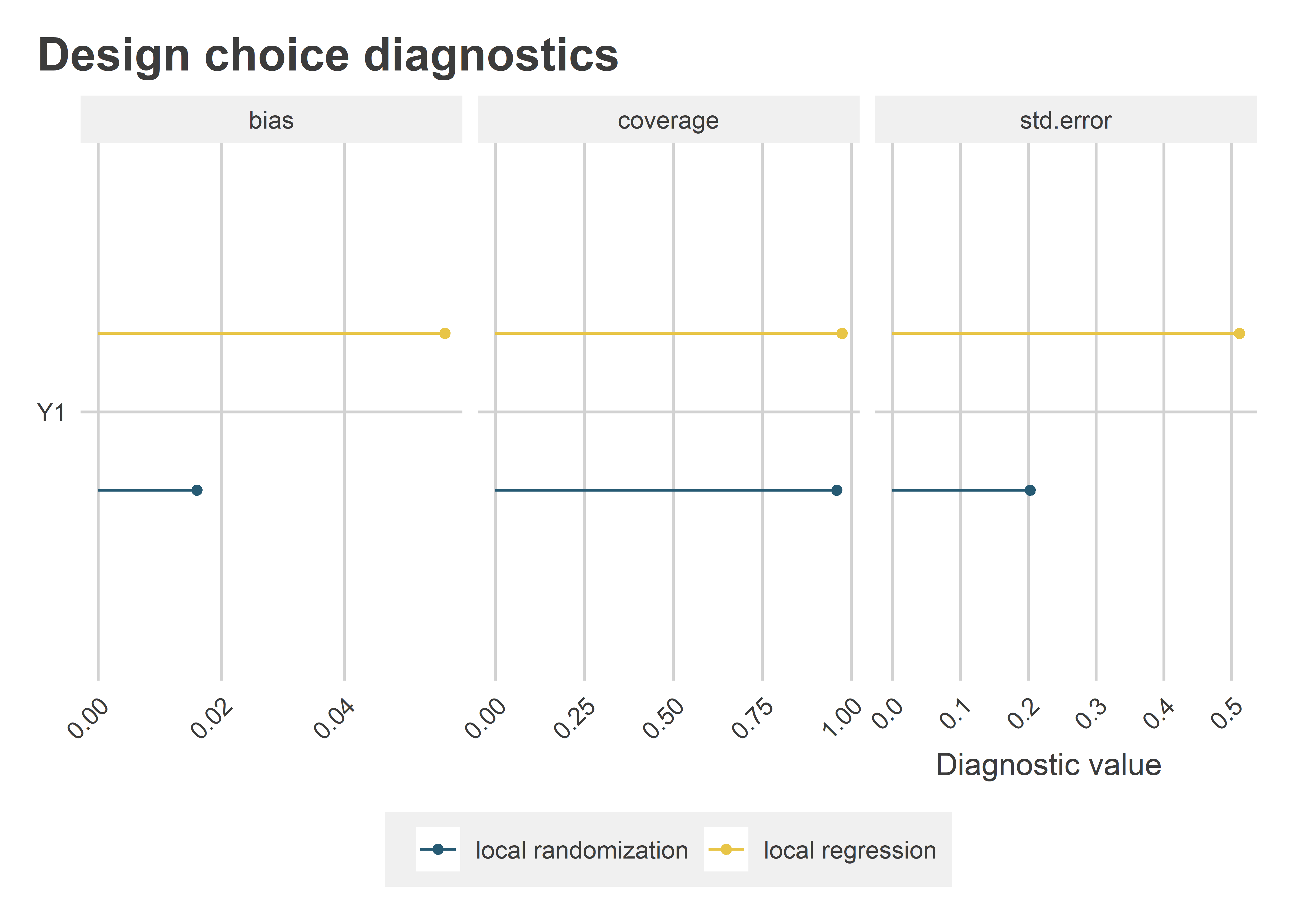
The following figure shows the relevant diagnostics: absolute bias and standard errors, like before, plus coverage of the 95% confidence intervals. As it turns out, when orthogonality holds, local randomization is better than local regression. It has lower average bias (this is probably a result of less noise), and it’s estimated with greater statistical precision. The takeaway: as long as local randomization’s assumptions hold, it actually has an edge over local regression. Even so, the coverage remains the same.
reg_out_4 |>
  mutate(
    design = rep(
      c("local randomization",
        "local regression"),
      each = n() / 2
    )
  ) |>
  group_split(
    design
  ) |>
  map_dfr(
    ~ evaluate(
      .x,
      what = "bias",
      truth = 0.5
    ) |>
      mutate(
        design = unique(.x$design)
      )
  ) |>
  select(bias, std.error, coverage, design) |>
  pivot_longer(
    cols = bias:coverage
  ) |>
  ggplot() +
  aes(
    x = abs(value),
    xmin = 0,
    xmax = abs(value),
    y = "Y1",
    color = design
  ) +
  facet_wrap(~ name, scales = "free_x") +
  geom_point(
    position = position_dodge(width = .7)
  ) +
  geom_errorbarh(
    height = 0,
    position = position_dodge(width = .7)
  ) +
  labs(
    x = "Diagnostic value",
    y = NULL,
    title = "Design choice diagnostics",
    color = NULL
  ) +
  ggpal() +
  theme(
    axis.text.x = element_text(
      angle = 45, hjust = 1
    )
  )
The Main Takeaway
If you can justify local randomization, that’s wonderful! Not only does it support a more intuitive estimand, it can provide reduced bias and greater statistical precision. But, that’s only if orthogonality between the outcome and the running variable can be met. Otherwise, local regression is the better way to go. Fortunately, whether the outcome and the running variable are correlated is easy to check, even within fairly narrow bandwidths.
As for me, I still prefer local regression. Even when orthogonality holds, local regression still has very low bias and its precision isn’t bad. On top of that, its coverage is just as good, which (to me) signals that the bias is not systematic and that the slightly wider standard errors are appropriate given the slightly noisier estimate. As a practical matter, this further raises the bar on what magnitude of estimate counts as statistically significant. Given the current replication crisis in social science, there’s something to be said for a more conservative hypothesis test. That’s just my opinion though.